Bike Data: Playing with the Play Button
July 17, 2018
One of the often overlooked features in Power BI is the “play axis” available on the scatter plot. This feature adds an additional axis at the bottom on the visualization which allows the user to loop through data. This can be very useful for observing patterns.
To begin, select the scatter plot option for your data.
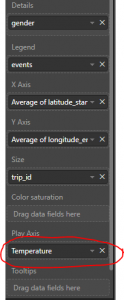
After selecting the scatter plot and selecting the relevant data, you’ll notice that there is an field titled “play axis” which will control the visualization.
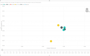
After implementing the play axis, an additional selection will appear at the bottom of the visualization complete with a play button which loops through the data points.