How to Count Distinct in a Pie Chart
July 27, 2018
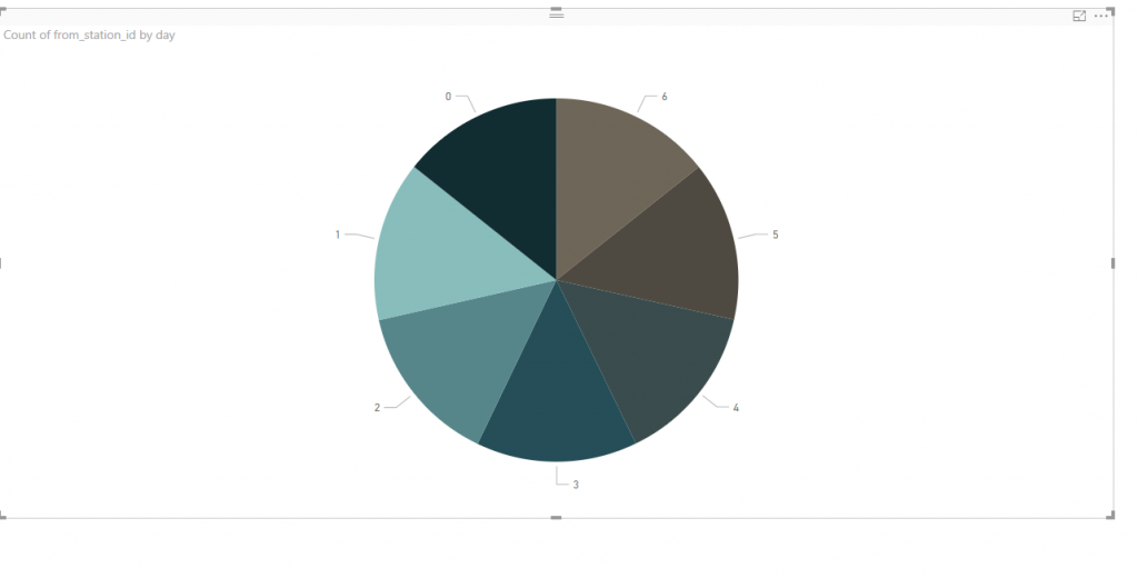
Recently, I created this pie chart based on distinct counts in Power BI. This was interesting simply because I didn’t think that there would be an difference in my data based on the day of the week, but there it was. The difference is slight, but surprising nonetheless.
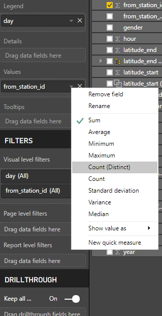
To create a pie chart with distinct counts, I started by selecting the pie chart visualization. I think added my day field to the “legend” input and added from station to the values option.

To switch from a total value on the from_station, I pressed the small downward arrow and selected “Count (Distinct) as shown in the image below.
My output was the pie chart showing the distinct value counts below.