Playing with Maps
Though the data I usually work with has very little to do with physical locations, I decided to play around with the maps visualization in Power BI this evening. Since the data set I’ve been playing with includes both latitude and longitude information, it was the perfect opportunity to try it out.
To begin with, I selected the map visualization which gave me several options for input fields. I dragged the latitude and longitude fields from the data into the appropriate boxes and was rewarded with a map of Chicago.
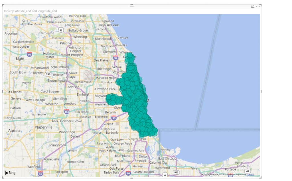
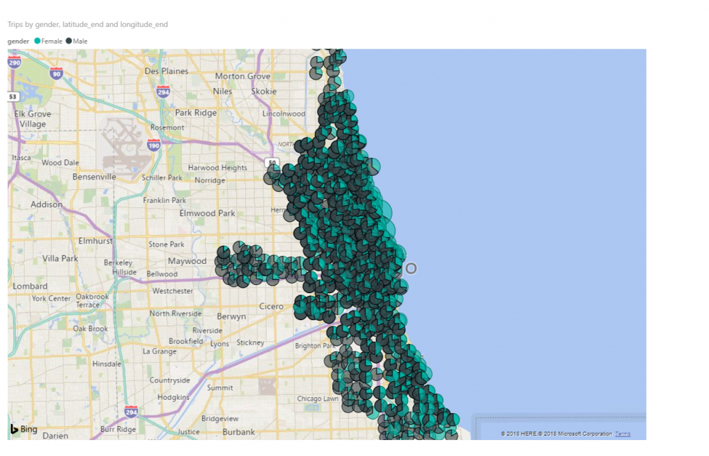
However, the map is really crowded when all the data is displayed. Just for fun, I added gender to the legend field and the visualization became slightly more overwhelming.
While wanting to avoid grouping the data, I added some page level filters which limited the rides to female riders in February in thunderstorms. This left me with a much smaller amount of rides and after zooming in, I started to see the details in the maps.
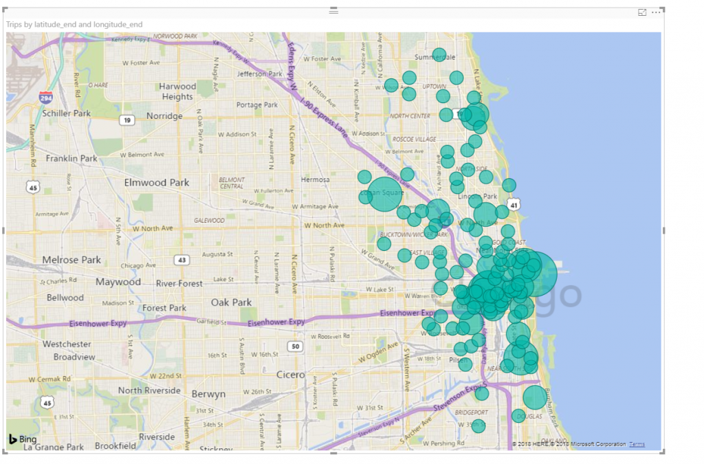
Though this is still a bit cluttered, it’s easy to see where distinctions in the data could start to be made.
It’s a fun feature to play.